
Avianis
A pilot app for managing and tracking flight operations. We saw the required framework transition as an opportunity to redesign the app and implement client feedback.
Role
Product Designer, UX/UI
Team


Timeline
October 2024 — Now
Methods
Initial Brief
The Avianis app needed to be rebuilt due to the current platform no longer being supported after May 2024. After evaluating various alternatives, the team decided to proceed with a new development framework.
The primary focus of this rebuild is to create a stable and reliable app that is fast to load and consolidates everything users need in one place. Key objectives include meeting all major client’s requirements, addressing a prioritized list of user requests, and delivering the revamped app by the end of 2024. The current app was sometimes a deal-breaker due to its lack of effective UI and UX, especially when compared to competitor apps.

Market Research
Landscape of aviation management software is quite competitive. There are lot of interesting companies that offer interesting aviation management software. Here are some of them:
- IFS (Sweden)
- AMOS (Switzerland)
- ForeFlight (United States)
- CORRIDOR (United States)
- FL3XX (Austria)
- Quantum Control (United States)

User Interview
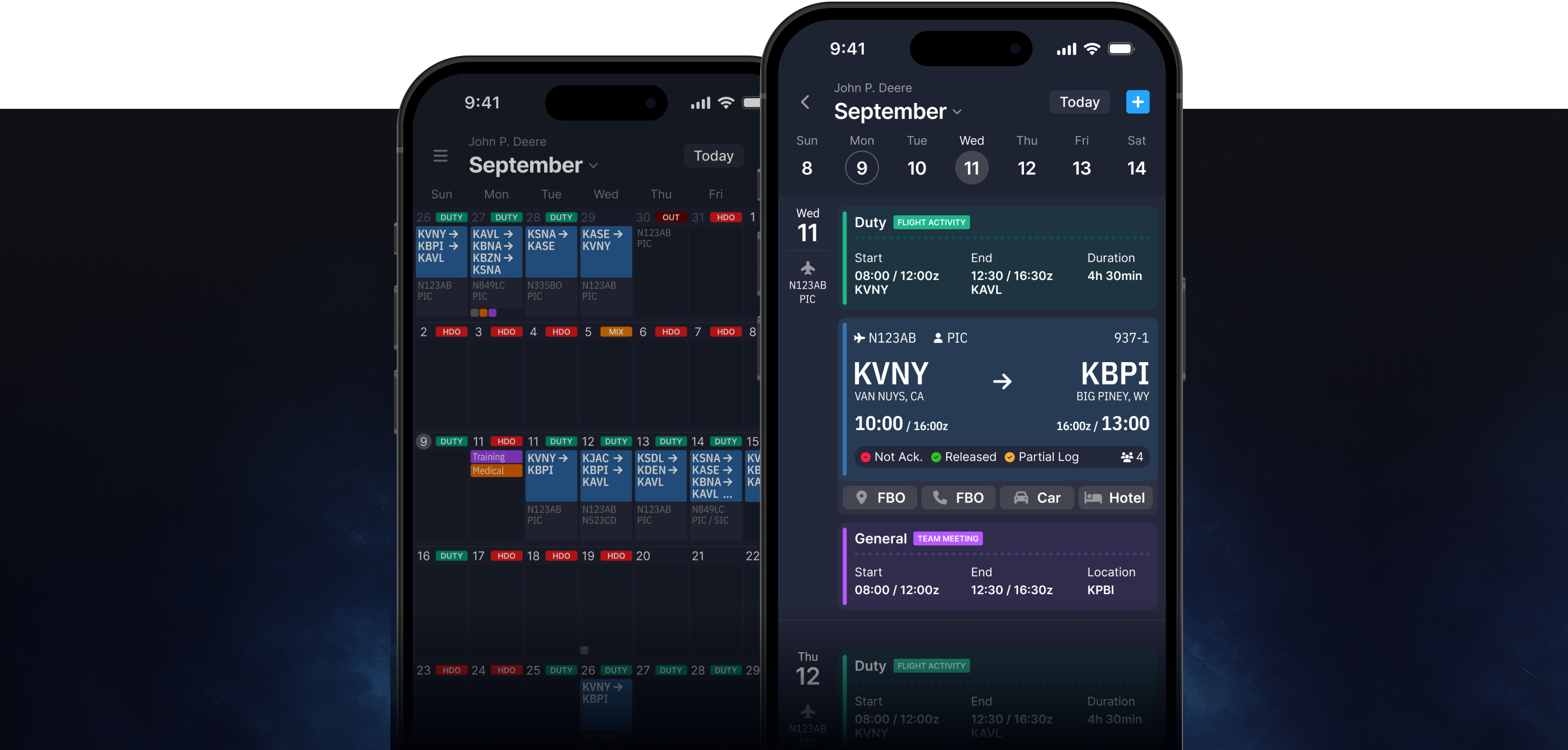
“I struggle to use the app in my workspace because the portrait view limits visibility and functionality.”
— Anonymous User
Since the previous app had been in use for quite some time, we had gathered extensive feedback. My task was to consolidate everything in one place, categorize it, and identify which issues were most critical and easiest to implement. With help of AI I’ve been able to do just that.
Among main pain points were:
- Request for landscape mode and dark mode to fit seamlessly into cockpit.
- Users face challenges with offline support and oscillating between offline and online modes.
- Users want better organization and filtering in some pages.
- They need improved duty time check-in/out workflows.
- Users request clearer visibility on high-level schedules.
- Improve login user flow.

People Problem
After all previous steps we can define general problem that users feel frustrated and inefficient because the app disrupts their workflow with cluttered interfaces, manual processes, and poor adaptability to their physical or technical environment, leading to wasted time, errors, and distrust.
This captures the core emotional and functional challenges revealed in the specific feedback. With these clear targets identified, we can proceed to the ideation phase.
Brainstorming
With the feedback now structured, we began generating ideas to solve these problems and improve the overall experience. In the first stage, we focused on quantity, aiming to generate as many ideas as possible. Our brainstorming session proved productive, yielding over 30 ideas.
Filtering Using Impact/Effort Matrix
Having ability to rework whole applications we decided to focus on quick wins first. Something that with low effort will gave us hight impact. Perfect tool for this was quadrant-based categorization of ideas, ensuring they align with the High Impact, Low Effort dynamics.
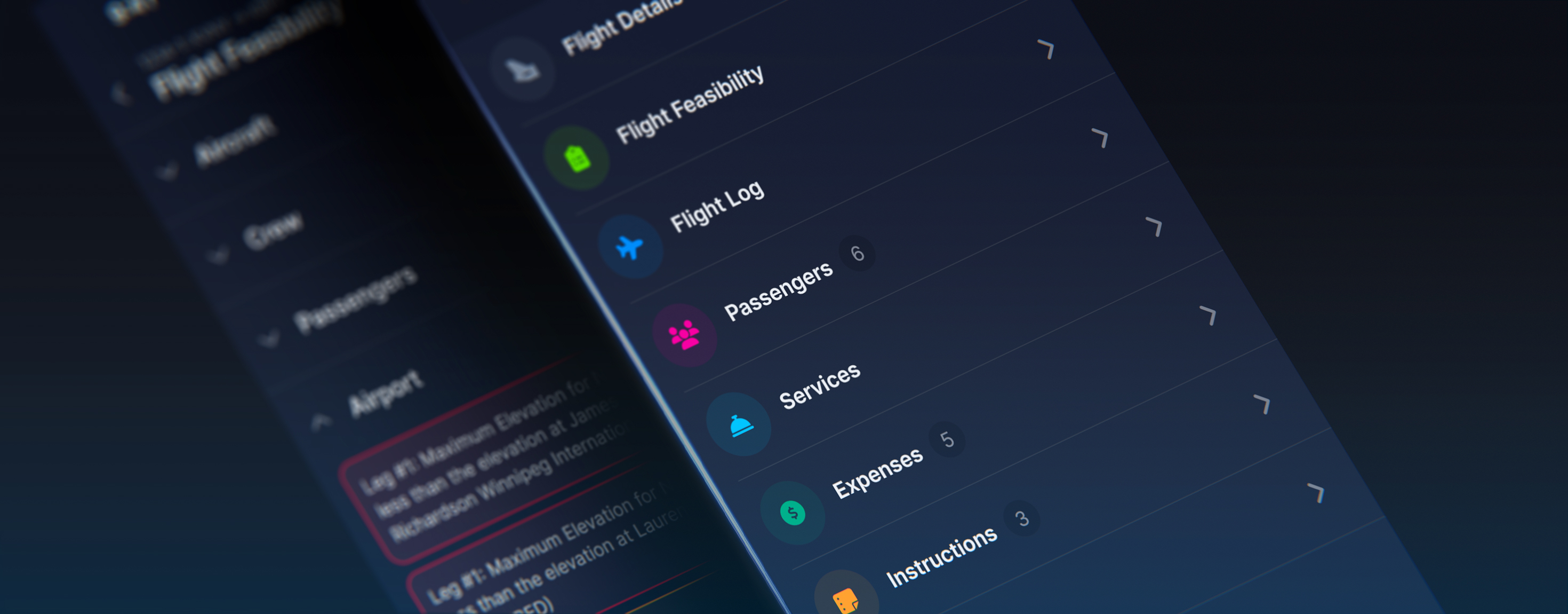
Task Flow
At this step, we developed a basic diagram showing the path a user will take in an application to complete various tasks.
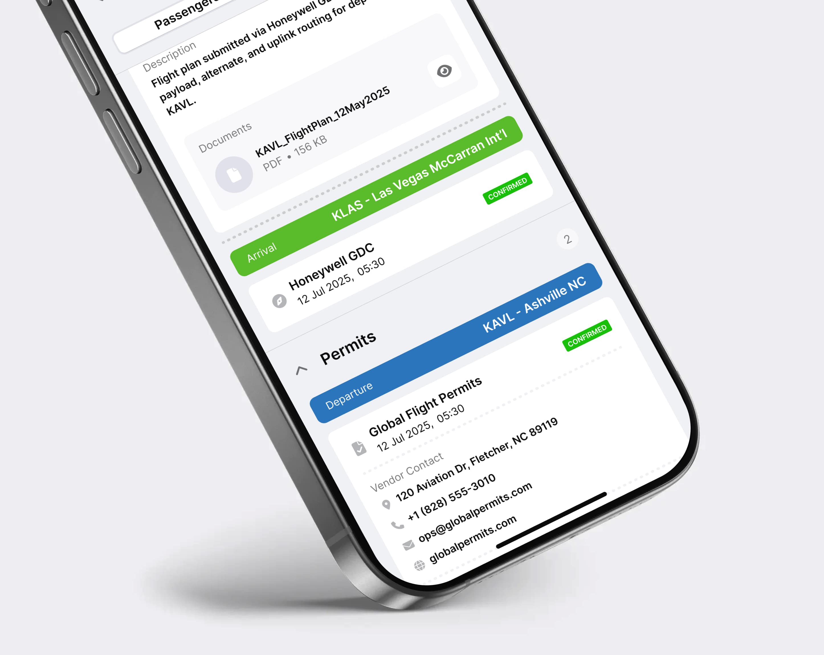
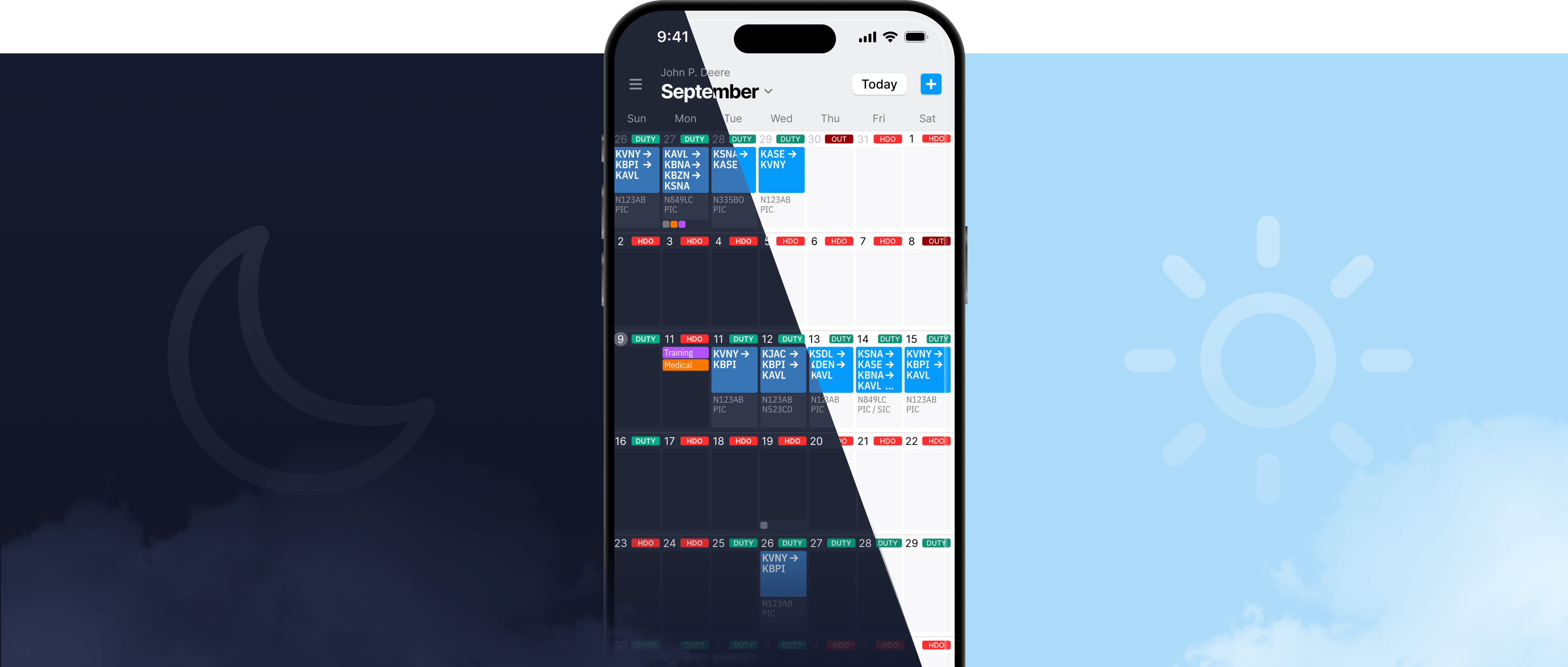
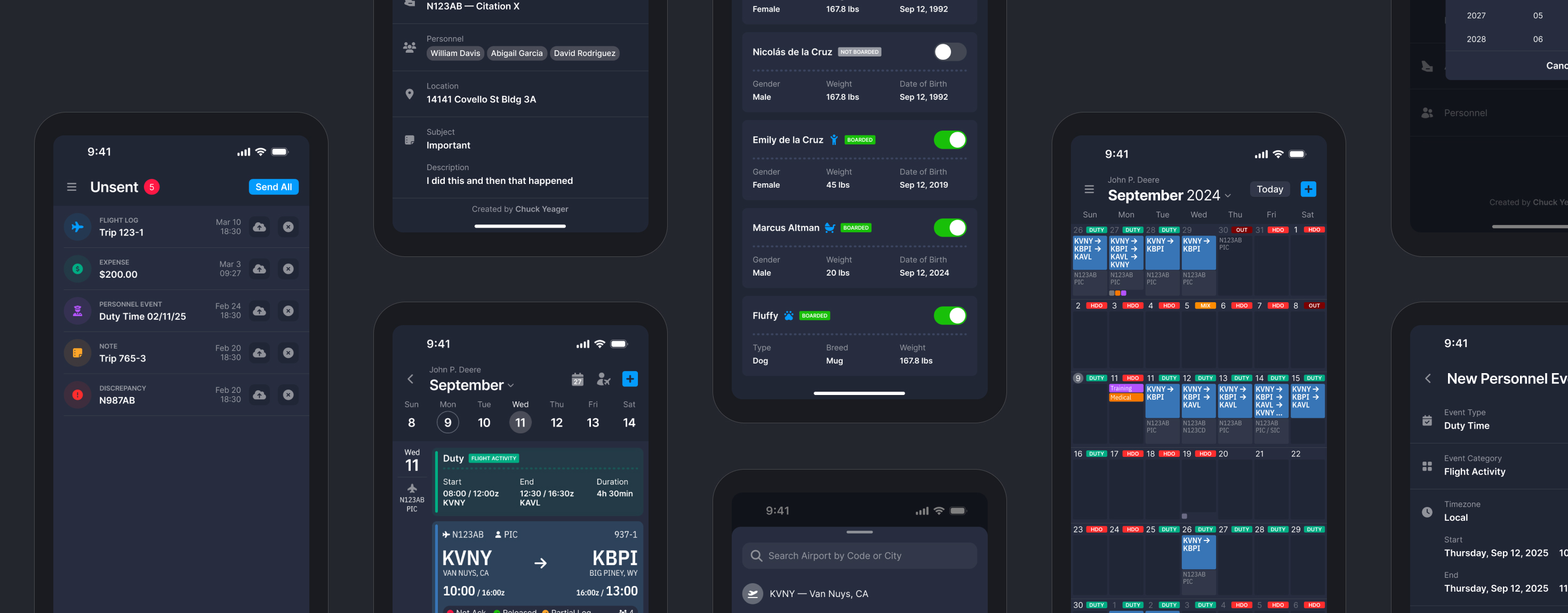
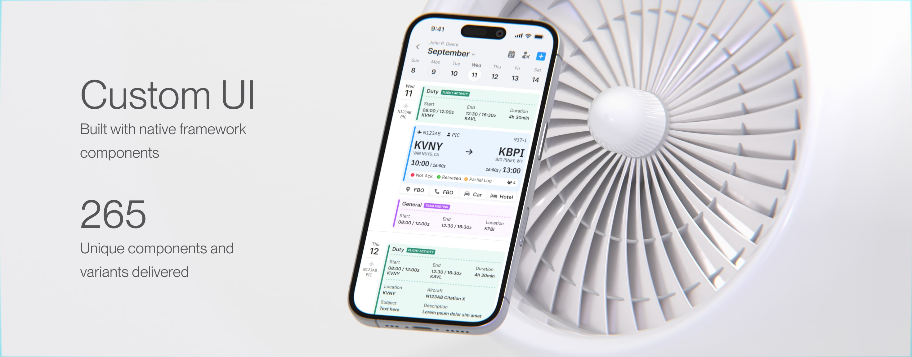
High-Fidelity
We provided with design both vertical and landscape views, in light and dark mode, for mobile and tablet. 8 design flows total counting more then 200 screens.
Design System
It was done from scratch. Taking into consideration all other popular libraries, picking the best or the features which we liked the most and adopt components to our use case.
Dark mode was priority from the start as important request from the users, therefore design system, thanks to variables, from very early stage supported it.
Collaboration
I would like to mention the collaboration with developers here. It was our first time working together, and we opted for maximum synchronization. We explored all possibilities — adapting the framework to fit the design and vice versa. In order, to meet deadlines and targets for the beta release.
Supervision
Throughout the development process, I actively supervised the design implementation to ensure visual and functional consistency. I reviewed builds regularly, provided feedback, and worked closely with developers to address any UI or UX deviations. This hands-on approach helped maintain design integrity and ensured the final product aligned with our initial vision.
Conclusion
Highlight of this project is importance of collaborative environment. Seamless work of the PM+Designer+Developers, trust and willing to go “extra mile” in order to achieve something unique and tailored to user needs.
Major Client
Redesign helped secure a hesitant enterprise client
200+
Total number of screens
90%
Screens built using reusable components
8
Different design adaptations
(mobile, tablet,
vertical, landscape)